Page History: GUI Panel Element
Compare Page Revisions
Page Revision: 2016/05/16 19:56

|
GUI Panel
|
| Info |
| Category: |
Behavioural Input |
|
AddIn: |
Base Elements |
| Creator: |
OkazoLab Team |
|
Scope: |
Parent Event |
| Owns Snippets: |
XAML Content |
|
Usage: |
|
Synchronized Internal Actions
| Experiment Start | Parent Event Onset | Status change between Onset/Offset | Parent Event Offset | Experiment End |
|---|
| | Is displayed on screen and starts accepting input. | | Turns off and disappears. | |
Properties
Generic Properties
| Name | Description | Constraints | Value Type | Upon Change |
|---|
| Settings |
| GUI Editor | Clicking on the green arrow next to the property will open the code editor for the element. The same can be achieved by clicking on the 'XAML Content' snippet. | |
| Is Input Enabled | Defines whether the user input is allowed into the GUI layout. If the value is false, the GUI layout is shown but its XAML elements are can not receive an user input (e.g. by the keyboard or mouse). | Boolean |
| Visual Theme | Defines a visual theme for the element's GUI. (Metro Dark / Light / White) | |
+=== Properties inherited from clVisualElement ===
| Name | Description | Constraints | Value Type | Upon Runtime Change |
|---|
| VISUAL APPEARANCE |
| Alpha Masking | Defines whether the visual content rendered by this element will be used as an opacity mask which is applied onto the given event surface. The active opacity mask allows one to expose pixels of the parent event surface through a solid background of the given event. If the value is true, the darker pixels of the content will make more transparent holes on the entire event surface. | | Boolean | |
| AntiAliasing | If true, the rendered content will be anti-aliased for smoother visual appearance. If false, rendering will be authentic to its source, e.g. a bitmap. | | Boolean | |
| Position | Defines the position of the element viewport on the screen. The position can be set in any of three coordinate systems: a) pixels, b) polar, c) central. | | clPoint | |
| Size | Defines the size of the element viewport on the screen. The size can be set in any of three coordinate systems: a) pixels, b) visual degrees, c) 'relative-to-screen' size. | | clSize | |
| Z Order | Indicates the current depth order of the element viewport on the surface of the parent event. The greatest number corresponds to the top position. The order can be changed by moving the element up and down in the element list. | | Int32 | |
| Pivot Point | Defines the pivot point (coordinate and the rotation centers) within the element viewport. | | stAlignment or Int32 | |
| Visible | Defines whether the element is currently visible on the event surface. The property is convenient for switching visual content on and off. | | Boolean | |
| Rotation | Defines the rotation angle (in degrees) of element viewport relative to the its pivot point. | | Double in the range 0..360 | |
| EFFECTS |
| Transparent Color | The color of the original pixels of rendered content that will be set as transparent. | | stColor | |
| Transparency Tolerance | Tolerance ratio for choosing colors that become transparent. Zero means that effect is not applied, 1 denotes that all colors will become trasparent. | | Int32, range (0..100) | |
| Color Mask | Produces a multiplicative combination of the original pixels and the selected mask color (except the alpha channel). The effect emulates a look through a colored glass. White or transparent mask color doesn't change the original pixels. | | stColor | |
| Opacity | Opacity of the rendered content. | | Int32, range (0..100) | |
| Contrast | Contrast of the rendered content. | | Int32, range (-100..100) | |
| Brightness | Defines the brighness of the rendered content. | | Int32, range (-100..100) | |
| Saturation | Saturation of the rendered content. | | Double | |
| Pixelation | Defines the pixel scale of the rendering. | | Int32, range (0..100) | |
| Blurring | The radius used in the gaussian blur of rendered content, as a pixel-based factor. The default is 0 which means no blurring. | | Int32 | |
| POSITIONAL JITTER |
| Reset Jitter | Set to true at runtime to reset the current positional jitter. | | Boolean, set true for action | |
| Current Jitter | Jitter range, in pixels (non inclusive). | . | clSize | |
| Jitter Range | Jitter range, centered at the original position of the element. | . | clSize | |
+=== Properties inherited from clElement ===
Inherited properties of clElement
| Name | Description | Constraints | Value Type | Upon Change |
|---|
| Control |
| Is Enabled | If set to false the element is completely omitted when the experiment is run. | | Boolean |
|
| Title | Title of the element. | | String |
|
GUI Panel element allows creating interactive GUI components on the presentation screen of an experiment.
Description
The GUI Panel element allows to lodge a user-defined layout of interactive GUI components (textboxes, buttons, sliders, checkboxes, etc.) into a selected zone on the
event surface. The GUI panel is created with the
XAML markup language and can host any number of GUI components, for example a custom questionnaire form. Properties of the GUI components can be bound to the global and
proxy variables.
This is particularly useful, if you need feedback from the user that is more elaborate than pressing a button on the keyboard. E.g select an option that is presented on screen.
Some example templates are provided by right-clicking on the code plane & selecting "Insert code template". (See screenshot 3)
Snapshots
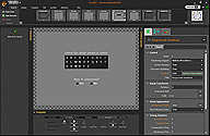 Example response form
made from xaml code | 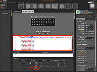 Code can be accessed by
clicking on the "XAML Content
snippet in the bottom plane |
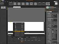 Right clicking in the code plane brings up a menue
from which one can select "Insert Code Template" | 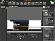 A list of Example templates |
Practical Use
Creating a simple response form
- Add a new event. Then click on "Add Element" -> "USER INTERFACE" -> 'GUI Panel'.
- Click on the "XAML Content" Snippet in the bottom plane as shown in the following screenshot:

Code can be accessed by
clicking on the "XAML Content
snippet in the bottom plane
- Paste in the following code:
<StackPanel Orientation="Vertical">

<TextBlock Text="Select the letter shown in white:"  Foreground="LightGray" FontFamily="Verdana" Margin="0,20,0,5"/>

<ListBox SelectedIndex="{Binding ResponseTarget}">

<ListBoxItem Content="A"/>

<ListBoxItem Content="B"/>

<ListBoxItem Content="C"/>

<ListBox.ItemsPanel>

<ItemsPanelTemplate>

<UniformGrid Columns="3" Rows="1"/>

</ItemsPanelTemplate>

</ListBox.ItemsPanel>

</ListBox>


<TextBlock Text="Was 'X' presented?" Foreground="LightGray" FontFamily="Verdana" Margin="0,40,0,5"  HorizontalAlignment="Center"/>

<StackPanel Orientation="Horizontal" HorizontalAlignment="Center">

<RadioButton Content="Yes" IsChecked="{Binding ResponseXPresent}" GroupName="1" Margin="0,0,30,0"/>

<RadioButton Content="No" IsChecked="{Binding ResponseXNotPresent}" GroupName="1"/>

</StackPanel></StackPanel>
- Note that the GUI elements are bound to certain variables: {Binding ResponseTarget} , {Binding ResponseXPresent} , {Binding ResponseXNotPresent}.
- Open the header snippet from the bottom plane. Paste in the following:
bool ResponseXPresent;

bool ResponseXNotPresent;

int ResponseTarget=-1;
- These are the variables that will hold the values of the user input.
- In addition, you may want to add some code to the 'Control Loop' snippet next to "Response & Feedback", so the program will know when to move on.
if ((ResponseTarget!=-1)&&((ResponseXPresent)||(ResponseXNotPresent)) {

... //record output, compare to expected output etc..

}
Demo experiment showing the GUI Panel element in action are available in the Demo Gallery within EventIDE: Demos -> Classical Paradigms -> 'Attentional Blink in RSVP' and Demos ->Questionnaires.
Notes
XAML will automatically scale the graphic to match the canvas.